ZIZO Brand Guide

Our identity and voice is important to us.  Here you will find all of the resources you need to stay on brand.

The ZIZO Logo

Our visual identity is representative of our vision and our culture. The ZiZo logo is an instantly recognizable symbol, and a focal point of our brand. To maintain consistency across our visual messaging, it is important that the logo is used exactly as specified in these guidelines

Logo Clearance & Size

In order to give our logo maximum legibility and exposure, please allow for an area of clearance around the entire logo. The distance of clearance should be the height of the Sprocket from the base of the center circle to the top of the longest arm. This gives the logo prominence and ensures that it will not be obscured or diminished by other surrounding elements.

ZIZO Logo Minimum Size

Never reproduce the Logo at a size smaller than these recommendations, as it will result in the loss of their impact and readability.

ZIZO Logo Usage

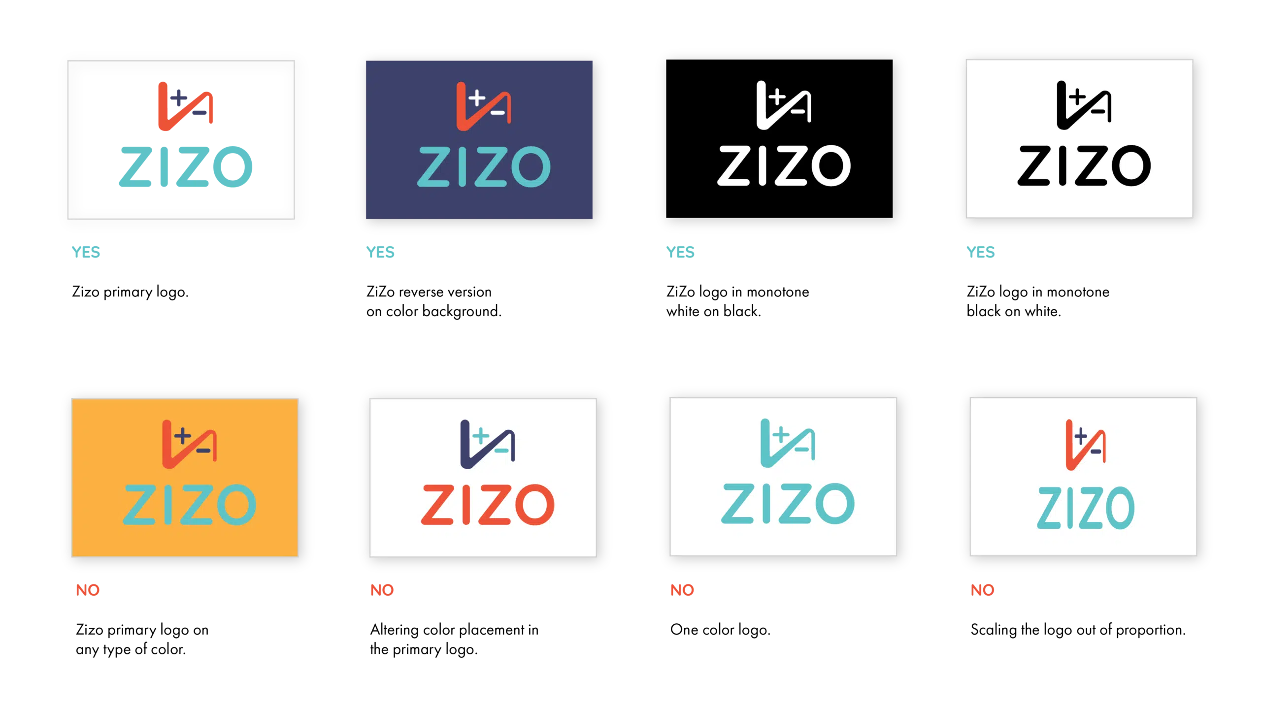
It is important that the appearance of the logo remains consistent. The logo should not be misinterpreted, modified, or added to. No attempt should be made to alter the logo in any way. Do not rotate, warp, or disproportionately scale the logo. Its orientation, color and composition should remain as indicated in this document—there are no exceptions.

Keep up to date with Zizo news and information by signing up for our newsletter!